Air Medical
Rebranding for a medical care and transport company.
Project Overview
Air medical is a rebranding project where I wanted to improve upon an existing company with little to no brand identity. The challenge in this project was searching for a balance between the two core aspects of the company: medical assistance and flight.
Research
The branding project started off with a brainstorming process. I listed out a variety of words that could be associated with Air and Medical. From those words, I narrowed it down to more specific words that could potentially relate to the company I was designing for.
Ideations
During the visualization process, I sketched potential logos based on the brainstorming lists. I combined different symbols and attributes.
Below are a few of the sketches that I came up with.

Refining
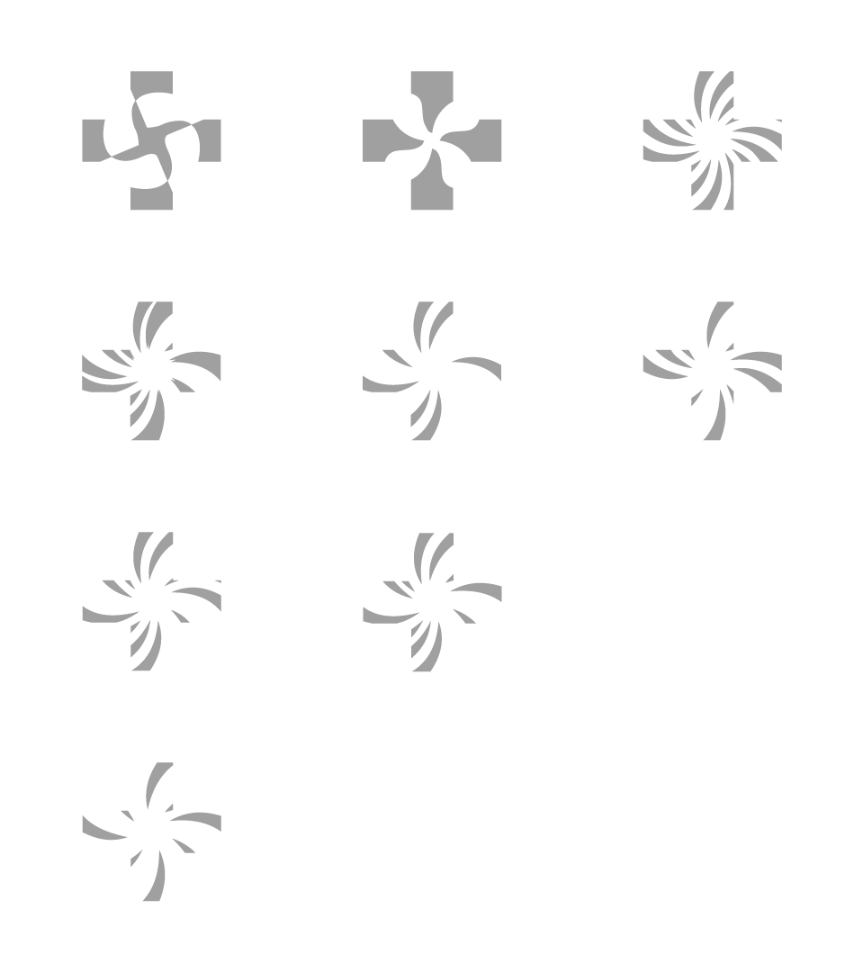
I decided to use the visualization of a rotating blade and the medical "plus" symbol. The rotating blade signifies the blades on a helicopter as well as the blades in the planes' motors. The medical plus symbol is actually a Red Cross symbol that many have used and associated with medicine and health.
Logo
Air Medical is a company that deals with emergency evacuations as well as health related transportation. I want the entire logomark and logotype to show professional health, prestigiousness, and calmness.
