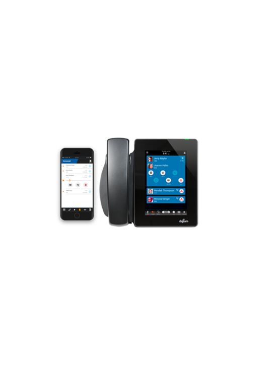
D80 Desk Phone & Softphone App
In the office or on the go, an all-in-one phone system.
Project Overview
Digium's Switchvox is a phone system that allows businesses to take advantage of Unified Communications* and collaboration tools. The newly updated mobile softphone gives employees the freedom to communicate how and where they need to - creating a simplified communications experience.
I contributed to the creation, design, and maintenance of the D80 desk phone and Smartphone mobile application's UI and UX. The D80 replaces the traditional desk phone as a complete touchscreen system with all of the capabilities of a conventional desk phone. The Softphone mobile app is used as an extension for the office desk phone for those who are always on the go.
*Unified Communications or UC can be described as the integration of communication products to create a seamless user experience
Research
The D80 desk phone and Softphone app was intended to reproduce but provide the same experience as traditional phones. The difficulty of doing this was to provide a seamless and simple user experience without over loading the user. Through research, I was able to learn and help provide a solution to this.
The initial research for users and features was already conducted prior to my addition on the two projects. My personal research was focused on understanding and analyzing the current systems and how they would work with the D80 and Softphone app.
For example, I had to branch out of my area of expertise by learning about how the web admin portal is used to connect and configure the IP phones. I had to consider how that admin portal was used to register a newly opened D80 or on a freshly installed Softphone app.

Initial State of Projects
When I first joined Digium, I was placed on the D80 project which was essentially an upgrade of a traditional desk phone. My core job function was to translate the traditional desk phone experience into a more digital and modern one. With that information, I aligned on marketing user requirements with the project manager, researched current capabilities on traditional desk phones as well as the current backend implementation of the D80.
In parallel, I began to work on the Softphone Android app. The initial wireframes had been done based off of the iOS app, which had already launched at this point. Given that the D80 would have a more modern UI/UX, I had to research the initial state of both the Android and iOS app screens to begin revamping the wireframes to match the product intent user experience and the look and feel of the D80. We wanted all 3 products, D80 desk phone, Android and iOS Softphone apps to feel like they were part of the same family.
Even though I was working on two separate projects at the same time, the main goal for both projects were aligned in maintaining the look, feel, and overall experience.
Challenges
One of the initial problems we ran into was duplicating the traditional phone experience into products that had no physical buttons.
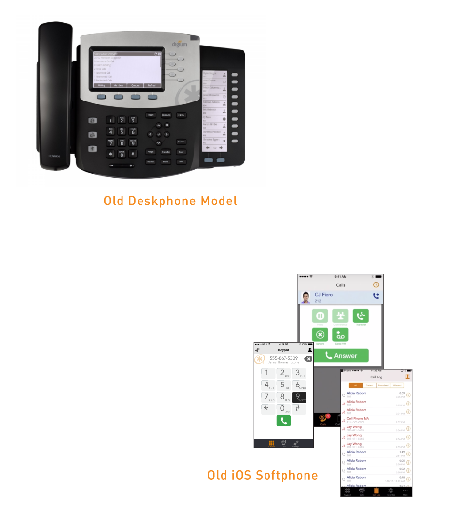
For the D80, that meant condensing about 50 to 60 physical buttons into a digital real-estate of about a tablet sized touch screen. Some key features of the traditional desk phone that were considered were the following: certain buttons were mapped to specific features, the navigation of the menu and settings, highlighting the most used and key features.
As for the Softphone app, I started working on the project when the iOS version was just released. The key features such as simple call controls, contacts, and voicemail were already implemented on the iOS version so what we had to worry about was the visual designs, user experience consistency, and screen real estate. We wanted the experience and features on both Android and iOS to be a hybrid of the office desk phone and a conventional mobile phone.
Project Goals
D80 Deskphone
- Create consistent experience similar to traditional desk phone
- Assist users who are used to only using physical buttons
Digium Softphone (iOS/Android)
- Create experience emulating Digium's desk phones
- Design features for mobile/on the go users
- Update iOS designs to have a consistent visual language as D80
User Testing
At Digium, there was no dedicated user research and user testing team. Our main stakeholders were our project managers who do have direct contact with Digium's customer base. Luckily, the technical support team and the software quality assurance team worked in the same building as I did. This allowed me to have a variety of users to go to when I needed user feedback on new designs. It was my responsibility to create a user experience that would be acceptable by the customer and I did so by developing different protocols of user testing.
Task-analysis was the main form of user testing that was conducted. I would give my user a list of goals or tasks that they would need to complete and then observe them. I would take notes as they went through the motions of using the D80 and Softphone apps (iOS and Android). A/B testing was another form of user testing that I performed. I would show users two different options and see what the users would liked more. Task-analysis worked better, because it allowed me to gather a better insight on how users would use the system.
Development
After getting the projects requirements from the project manager (PM) and doing my own user research, the next step in my design process usually starts with rough sketches. During this phase, I frequently met with the development team and the PM to optimize the work flow as much as possible. For the D80 and Softphone apps, the main focus during these meetings was to ensure that the experience of setting up to making a call utilizing the new system was consistent with our original desk phones.
After the main flow was established and agreed on, I started to create higher fidelity mockups via tools like Adobe XD and Sketch for static screens. I also used Adobe XD and After Effects for clickthrough prototypes and interaction animation. Each screen typically goes through multiple iterations depending on the complexity and amount of features present. During the iterations, there are reviews performed with the development team to get by in from them as well as the PM.
Look and Feel
After all the features and user flows were hammered out, the visual language was the next focus. We used the Google's Design System's guidelines for developing our visual language. Once the visual language was developed, it was first implemented on the screens for the D80 system and then onto the Android app. To keep the look and feel consistent across all of Digium's new platforms, updates were done to adopt this visual design for the iOS app while taking into account Apple's Human Interface Guidelines (HIG).
We decided on using a card system for conference, incoming, and outgoing calls. The phone's call card system contained different states such as active and expanded, minimized or on hold. The call cards would also become a minimized state when users navigated throughout the UI. We wanted the users to have multiple ongoing call cards visible at all times so that the user has an easy way of updating the state of different calls in one view. By having the call cards visible, the user is able to expand the call of interest, and update the card control at that moment (hold, end call, etc.).
D80 Deskphone
Switchvox Softphone
Conclusion
Working on both projects at the same time with two different development teams was a first for me. In the end, we were able to create a product that reproduced and modernized the traditional desk phone in a unified user experience across all three platforms. The D80 development team was based in Digium's headquarters halfway across the country whereas the mobile development team was down the hall. I was able to do the above despite the challenges of not being co-located, working with different development teams, time zones, and working in a digital meeting space.
If given the opportunity to work on a similar project, I would like to utilize the skills I have gained throughout this journey to optimize the review and iteration time by handling meeting agendas and timelines efficiently. I would also want to document the entire process differently as well. When I was designing, I also had to create Jira tickets and Confluence pages for specs. However, in addition I would have also wanted to keep track of all the sketches, iterations, and meetings organized visually as well.
Overall, this was an awesome experience that definitely helped me grow personally and as a designer.
